More advanced plotting with Pandas/Matplotlib
At this point you should know the basics of making plots with Matplotlib module. Now we will expand on our basic plotting skills to learn how to create more advanced plots. In this part, we will show how to visualize data using Pandas/Matplotlib and create plots such as the one below.
The data
In this part of the lesson we’ll continue working with our weather observation data from the Helsinki-Vantaa airport downloaded from NOAA.
Getting started
Let’s start again by importing the libraries we’ll need.
[1]:
import pandas as pd
import matplotlib.pyplot as plt
Loading the data
Now we’ll load the data just as we had previously in the last part of the lesson. This will take a moment, we have a large dataset :D.
[2]:
fp = r"data/029740.txt"

data = pd.read_csv(fp, delim_whitespace=True,
                   na_values=['*', '**', '***', '****', '*****', '******'],
                   usecols=['YR--MODAHRMN', 'TEMP', 'MAX', 'MIN'],
                   parse_dates=['YR--MODAHRMN'], index_col='YR--MODAHRMN')
[3]:
print("Number of rows:", len(data))
Number of rows: 931767
OK, we’re closing in on one million rows of data.
Let’s have a closer look at the time and temperature columns:
[4]:
print(data.head())
                     TEMP   MAX   MIN
YR--MODAHRMN
1952-01-01 00:00:00  36.0   NaN   NaN
1952-01-01 06:00:00  37.0   NaN  34.0
1952-01-01 12:00:00  39.0   NaN   NaN
1952-01-01 18:00:00  36.0  39.0   NaN
1952-01-02 00:00:00  36.0   NaN   NaN
Let’s go ahead and rename the 'TEMP' column, since we’ll later convert our temperatures from Fahrenheit to Celsius.
[5]:
new_names = {'TEMP':'TEMP_F'}
data = data.rename(columns=new_names)
Preparing the data
First, we have to deal with no data values. Let’s check how many no data values we have:
[6]:
print('Number of no data values per column: ')
print(data.isna().sum())
Number of no data values per column:
TEMP_F      3579
MAX       900880
MIN       900896
dtype: int64
So, we have 3579 missing values in the TEMP_F column. Let’s get rid of those. We need not worry about the 'MAX' and 'MIN' columns since we won’t be using them.
We can remove rows from our DataFrame where 'TEMP_F' is missing values using the dropna() method:
[7]:
data.dropna(subset=['TEMP_F'], inplace=True)
[8]:
print("Number of rows after removing no data values:", len(data))
Number of rows after removing no data values: 928188
That’s better.
Converting temperatures to Celsius
Now that we have loaded our data, we can convert the values of temperature in Fahrenheit to Celsius, like we have in earlier lessons.
[9]:
data["TEMP_C"] = (data["TEMP_F"] - 32.0) / 1.8
Let’s check how our dataframe looks like at this point:
[10]:
data.head()
[10]:
| TEMP_F | MAX | MIN | TEMP_C | |
|---|---|---|---|---|
| YR--MODAHRMN | ||||
| 1952-01-01 00:00:00 | 36.0 | NaN | NaN | 2.222222 |
| 1952-01-01 06:00:00 | 37.0 | NaN | 34.0 | 2.777778 |
| 1952-01-01 12:00:00 | 39.0 | NaN | NaN | 3.888889 |
| 1952-01-01 18:00:00 | 36.0 | 39.0 | NaN | 2.222222 |
| 1952-01-02 00:00:00 | 36.0 | NaN | NaN | 2.222222 |
Using subplots
Let’s continue working with the weather data and learn how to use subplots. Subplots are figures where you have multiple plots in different panels of the same figure, as was shown at the start of the lesson.
Extracting seasonal temperatures
Let’s now select data from different seasons of the year in 2012/2013:
- Winter (December 2012 - February 2013)
- Spring (March 2013 - May 2013)
- Summer (June 2013 - August 2013)
- Autumn (Septempber 2013 - November 2013)
[11]:
winter = data.loc[(data.index >= '201212010000') & (data.index < '201303010000')]
winter_temps = winter['TEMP_C']

spring = data.loc[(data.index >= '201303010000') & (data.index < '201306010000')]
spring_temps = spring['TEMP_C']

summer = data.loc[(data.index >= '201306010000') & (data.index < '201309010000')]
summer_temps = summer['TEMP_C']

autumn = data.loc[(data.index >= '201309010000') & (data.index < '201312010000')]
autumn_temps = autumn['TEMP_C']
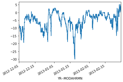
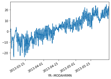
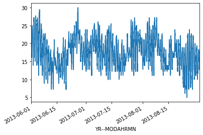
Now we can plot our data to see how the different seasons look separately.
[12]:
ax1 = winter_temps.plot()
[13]:
ax2 = spring_temps.plot()
[14]:
ax3 = summer_temps.plot()
[15]:
ax4 = autumn_temps.plot()
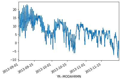
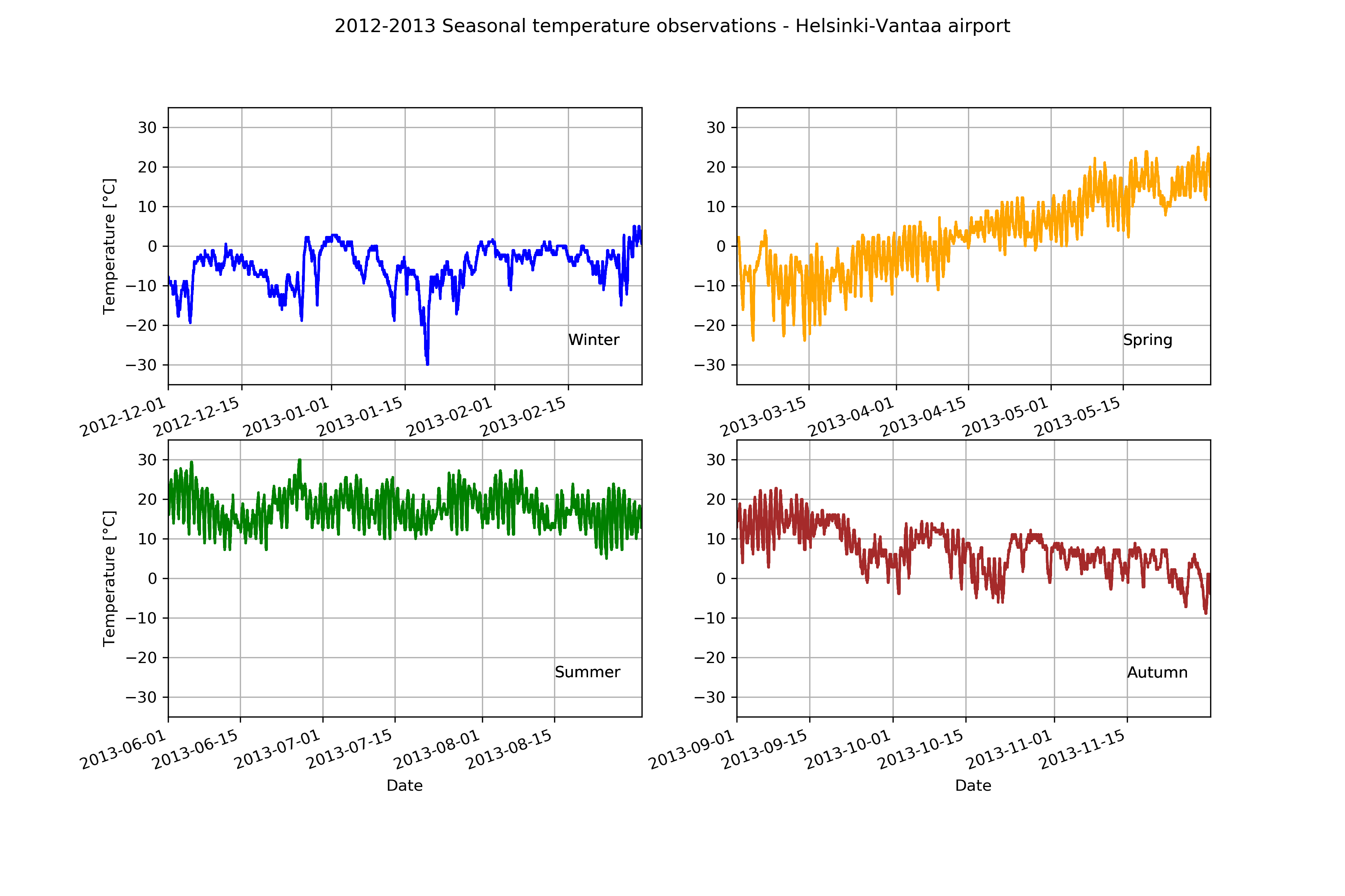
OK, so from these plots we can already see that the temperatures in different seasons are quite different, which is rather obvious of course. It is important to also notice that the scale of the y-axis changes in these different plots. If we would like to compare different seasons to each other we need to make sure that the temperature scale is similar in the plots of the different seasons.
Finding data bounds
Let’s set our y-axis limits so that the upper limit is the maximum temperature + 5 degrees in our data (full year), and the lowest is the minimum temperature - 5 degrees.
[16]:
min_temp = min(winter_temps.min(), spring_temps.min(), summer_temps.min(), autumn_temps.min())
min_temp = min_temp - 5.0
max_temp = max(winter_temps.max(), spring_temps.max(), summer_temps.max(), autumn_temps.max())
max_temp = max_temp + 5.0

print("Min:", min_temp, "Max:", max_temp)
Min: -35.0 Max: 35.0
OK, so now we can see that the minimum temperature in our data is -35 degrees and the maximum is +35 degrees. We can now use those values to standardize the y-axis scale of our plot.
Creating our first set of subplots
Let’s now continue and see how we can plot all these different plots into the same figure. We can create a 2x2 panel for our visualization using Matplotlib’s subplots() function where we specify how many rows and columns we want to have in our figure. We can also specify the size of our figure with figsize() parameter that takes the width and height values (in inches) as input.
[17]:
fig, axes = plt.subplots(nrows=2, ncols=2, figsize=(12,8));
axes
[17]:
array([[<matplotlib.axes._subplots.AxesSubplot object at 0x114d49990>,
        <matplotlib.axes._subplots.AxesSubplot object at 0x114ea6750>],
       [<matplotlib.axes._subplots.AxesSubplot object at 0x114e22410>,
        <matplotlib.axes._subplots.AxesSubplot object at 0x114d8c790>]],
      dtype=object)
We can see that as a result we have now a list containing two nested lists where the first one contains the axis for column 1 and 2 on row 1 and the second list contains the axis for columns 1 and 2 for row 2. We can parse these axes into own variables so it is easier to work with them.
[18]:
ax11 = axes[0][0]
ax12 = axes[0][1]
ax21 = axes[1][0]
ax22 = axes[1][1]
Now we have four different axis variables for different panels in our figure. Next we can use them to plot the seasonal data into them. Let’s first plot the seasons and give different colors for the lines, and specify the y-scale limits to be the same with all subplots. With parameter c it is possible to specify the color of the line. You can find an extensive list of possible colors and RGB-color codes from this link. With lw
parameter you can specify the width of the line.
[19]:
# Set plot line width
line_width = 1.5

# Plot data
winter_temps.plot(ax=ax11, c='blue', lw=line_width, ylim=[min_temp, max_temp])
spring_temps.plot(ax=ax12, c='orange', lw=line_width, ylim=[min_temp, max_temp])
summer_temps.plot(ax=ax21, c='green', lw=line_width, ylim=[min_temp, max_temp])
autumn_temps.plot(ax=ax22, c='brown', lw=line_width, ylim=[min_temp, max_temp])

# Display figure
fig
[19]:
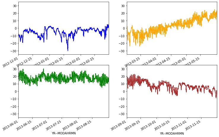
Great, now we have all the plots in same figure! However, we can see that there are some problems with our x-axis labels and a few missing items we can add. Let’s do that below.
[20]:
# Create the new figure and subplots
fig, axes = plt.subplots(nrows=2, ncols=2, figsize=(12,8))

# Rename the axes for ease of use
ax11 = axes[0][0]
ax12 = axes[0][1]
ax21 = axes[1][0]
ax22 = axes[1][1]

Now, we’ll add our seasonal temperatures to the plot commands for each time period.
[21]:
# Set plot line width
line_width = 1.5

# Plot data
winter_temps.plot(ax=ax11, c='blue', lw=line_width,
                  ylim=[min_temp, max_temp], grid=True)
spring_temps.plot(ax=ax12, c='orange', lw=line_width,
                  ylim=[min_temp, max_temp], grid=True)
summer_temps.plot(ax=ax21, c='green', lw=line_width,
                  ylim=[min_temp, max_temp], grid=True)
autumn_temps.plot(ax=ax22, c='brown', lw=line_width,
                  ylim=[min_temp, max_temp], grid=True)

# Set figure title
fig.suptitle('2012-2013 Seasonal temperature observations - Helsinki-Vantaa airport')

# Rotate the x-axis labels so they don't overlap
plt.setp(ax11.xaxis.get_majorticklabels(), rotation=20)
plt.setp(ax12.xaxis.get_majorticklabels(), rotation=20)
plt.setp(ax21.xaxis.get_majorticklabels(), rotation=20)
plt.setp(ax22.xaxis.get_majorticklabels(), rotation=20)

# Axis labels
ax21.set_xlabel('Date')
ax22.set_xlabel('Date')
ax11.set_ylabel('Temperature [°C]')
ax21.set_ylabel('Temperature [°C]')

# Season label text
ax11.text(pd.to_datetime('20130215'), -25, 'Winter')
ax12.text(pd.to_datetime('20130515'), -25, 'Spring')
ax21.text(pd.to_datetime('20130815'), -25, 'Summer')
ax22.text(pd.to_datetime('20131115'), -25, 'Autumn')

# Display plot
fig
[21]:
Not bad.