Plotting with Pandas (…and Matplotlib…and Bokeh)
As we’re now familiar with some of the features of Pandas, we will wade into visualizing our data in Python by using the built-in plotting options available directly in Pandas. Much like the case of Pandas being built upon NumPy, plotting in Pandas takes advantage of plotting features from the Matplotlib plotting library. Plotting in Pandas provides a basic framework for visualizing our data, but as you’ll
see we sometimes need to use features from Matplotlib to enhance our plots. In particular, we will use features from the the pyplot module in Matplotlib, which provides MATLAB-like plotting.
Toward the end of the lesson we will also explore interactive plots using the Pandas-Bokeh plotting backend, which allows us to produce plots similar to those available in the Bokeh plotting library, but using plotting syntax similar to that used normally in Pandas.
Input data
In the lesson this week we are using some of the same weather observation data from Finland downloaded from NOAA that we used in Lesson 6. In this case we’ll focus on weather observation station data from the Helsinki-Vantaa airport.
Downloading the data
Just like last week, the first step for today’s lesson is to get the data. Unlike last week, we’ll all download and use the same data.
You can download the data by opening a new terminal window in Jupyter Lab by going to File -> New -> Terminal in the Jupyter Lab menu bar. Once the terminal is open, you will need to navigate to the directory for Lesson 7 by typing
cd notebooks/notebooks/L7/
or the equivalent command to navigate to the location of the Lesson 7 files on your computer (for those running Jupyter on their own computers).
You can now confirm you’re in the correct directory by typing
ls
You should see something like the following output:
advanced-plotting.ipynb img
data                    matplotlib.ipynb
If so, you’re in the correct directory and you can download the data files by typing
wget https://davewhipp.github.io/data/Finland-weather-data-L7.tar.gz
After the download completes, you can extract the data files by typing
tar zxvf Finland-weather-data-L7.tar.gz
At this stage you should have a new directory called data that contains the data for this week’s lesson. You can confirm this by typing
ls data
You should see something like the following:
029740.txt           6367598020644inv.txt
3505doc.txt          6367598020644stn.txt
Now you should be all set to proceed with the lesson!
Binder users
It is not recommended to complete this lesson using Binder.
About the data
As part of the download there are a number of files that describe the weather data. These metadata files include:
- A list of stations: data/6367598020644stn.txt
- Details about weather observations at each station: data/6367598020644inv.txt
- A data description (i.e., column names): data/3505doc.txt
The input data for this week are separated with varying number of spaces (i.e., fixed width). The first lines and columns of the data look like following:
  USAF  WBAN YR--MODAHRMN DIR SPD GUS CLG SKC L M H  VSB MW MW MW MW AW AW AW AW W TEMP DEWP    SLP   ALT    STP MAX MIN PCP01 PCP06 PCP24 PCPXX SD
029740 99999 195201010000 200  23 ***  15 OVC 7 2 *  5.0 63 ** ** ** ** ** ** ** 6   36   32  989.2 ***** ****** *** *** ***** ***** ***** ***** **
029740 99999 195201010600 220  18 ***   8 OVC 7 2 *  2.2 63 ** ** ** ** ** ** ** 6   37   37  985.9 ***** ****** ***  34 ***** ***** ***** ***** **
029740 99999 195201011200 220  21 ***   5 OVC 7 * *  3.8 59 ** ** ** ** ** ** ** 5   39   36  988.1 ***** ****** *** *** ***** ***** ***** ***** **
029740 99999 195201011800 250  16 *** 722 CLR 0 0 0 12.5 02 ** ** ** ** ** ** ** 5   36   27  991.9 ***** ******  39 *** ***** ***** ***** ***** **
Getting started
Let’s start by importing Pandas and reading our data file.
[1]:
import pandas as pd
Just as we did last week, we’ll read our data file by passing a few parameters to the Pandas read_csv() function. In this case, however, we’ll include a few additional parameters in order to read the data with a datetime index. Let’s read the data first, then see what happened.
[2]:
fp = r"data/029740.txt"

data = pd.read_csv(fp, delim_whitespace=True,
                   na_values=['*', '**', '***', '****', '*****', '******'],
                   usecols=['YR--MODAHRMN', 'TEMP', 'MAX', 'MIN'],
                   parse_dates=['YR--MODAHRMN'], index_col='YR--MODAHRMN')
So what’s different here? Well, we have added two new parameters: parse_dates and index_col.
parse_datestakes a Python list of column name(s) containing date data that Pandas will parse and convert to the datetime data type. For many common date formats this parameter will automatically recognize and convert the date data.index_colis used to state a column that should be used to index the data in the DataFrame. In this case, we end up with our date data as the DataFrame index. This is a very useful feature in Pandas as we’ll see below.
Having read in the data, let’s have a quick look at what we have using data.head().
[3]:
data.head()
[3]:
| TEMP | MAX | MIN | |
|---|---|---|---|
| YR--MODAHRMN | |||
| 1952-01-01 00:00:00 | 36.0 | NaN | NaN |
| 1952-01-01 06:00:00 | 37.0 | NaN | 34.0 |
| 1952-01-01 12:00:00 | 39.0 | NaN | NaN |
| 1952-01-01 18:00:00 | 36.0 | 39.0 | NaN |
| 1952-01-02 00:00:00 | 36.0 | NaN | NaN |
As mentioned above, you can now see that the index column for our DataFrame (the first column) contains date values related to each row in the DataFrame.
Basic x-y plot
Now we’re ready for our first plot. We can run one command first to configure the plots to display nicely in our Jupyter notebooks.
[4]:
%matplotlib inline
OK, so let’s get to plotting! We can start by using the basic line plot in Pandas to look at our temperature data.
[5]:
ax = data.plot()
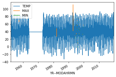
If all goes well, you should see the plot above.
OK, so what happened here?
- We first create the plot object using the
plot()method of thedataDataFrame. Without any parameters given, this makes the plot of all columns in the DataFrame as lines of different color on the y-axis with the index, time in this case, on the x-axis. - In case we want to be able to modify the plot or add anything, we assign the plot object to the variable
ax. We can check its type below.
Coming back to the ax variable, let’s check its type…
[6]:
type(ax)
[6]:
matplotlib.axes._subplots.AxesSubplot
OK, so it looks like we have some kind of plot data type that is part of Matplotlib. Clearly, Pandas is using Matplotlib for generating our plots.
Selecting our plotted data
Now, let’s make a few small changes to our plot and plot the data again. First, let’s only plot the observed temperatures in the data['TEMP'] column, and let’s restrict ourselves to observations from the afternoon of October 1, 2019 (the last day in our dataset). We can do this by selecting the desired data column and date range first, then plotting our selection.
[7]:
oct1_temps = data['TEMP'].loc[data.index >= '201910011200']
ax = oct1_temps.plot()
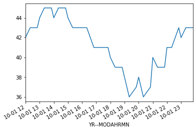
So, what did we change? Well, first off we selected only the 'TEMP' column now by using data['TEMP'] instead of data. Second, we’ve added a restriction to the date range using the loc[] to select only rows where the index value data.index is greater than '201910011200'. In that case, the number in the string is in the format 'YYYYMMDDHHMM', where YYYY is the year, MM is the month, DD is the day, HH is the hour, and MM is the minute. Now we have all
observations from noon onward on October 1, 2019. By saving this selection to the DataFrame oct1_temps we’re able to now use oct1_temps.plot() to plot only our selection. This is cool, but we can do better…
Basic plot formatting
We can make our plot look a bit nicer and provide more information by using a few additional plotting options to Pandas/Matplotlib.
[8]:
ax = oct1_temps.plot(style='ro--', title='Helsinki-Vantaa temperatures')
ax.set_xlabel('Date')
ax.set_ylabel('Temperature [°F]')
[8]:
Text(0, 0.5, 'Temperature [°F]')
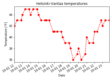
Now we see our temperature data as a red dashed line with circles showing the data points. This comes from the additional style='ro--' used with oct1_temps.plot(). In this case, r tells the oct1_temps.plot() function to use red color for the lines and symbols, o tells it to show circles at the points, and -- says to use a dashed line. You can use help(oct1_temps.plot) to find out more about formatting plots or have a look at the documentation on the Pandas
website. We have also added a title using the title parameter, but note that axis labels are assigned using the set_xlabel() and set_ylabel() methods. As you can see in this case, by assigning the plot axes to the variable ax
[9]:
help(oct1_temps.plot)
Help on PlotAccessor in module pandas.plotting._core object:
class PlotAccessor(pandas.core.base.PandasObject)
| PlotAccessor(data)
|
| Make plots of Series or DataFrame using the backend specified by the
| option ``plotting.backend``. By default, matplotlib is used.
|
| Parameters
| ----------
| data : Series or DataFrame
| The object for which the method is called
| x : label or position, default None
| Only used if data is a DataFrame.
| y : label, position or list of label, positions, default None
| Allows plotting of one column versus another. Only used if data is a
| DataFrame.
| kind : str
| - 'line' : line plot (default)
| - 'bar' : vertical bar plot
| - 'barh' : horizontal bar plot
| - 'hist' : histogram
| - 'box' : boxplot
| - 'kde' : Kernel Density Estimation plot
| - 'density' : same as 'kde'
| - 'area' : area plot
| - 'pie' : pie plot
| - 'scatter' : scatter plot
| - 'hexbin' : hexbin plot
| figsize : a tuple (width, height) in inches
| use_index : bool, default True
| Use index as ticks for x axis
| title : string or list
| Title to use for the plot. If a string is passed, print the string
| at the top of the figure. If a list is passed and `subplots` is
| True, print each item in the list above the corresponding subplot.
| grid : bool, default None (matlab style default)
| Axis grid lines
| legend : False/True/'reverse'
| Place legend on axis subplots
| style : list or dict
| matplotlib line style per column
| logx : bool or 'sym', default False
| Use log scaling or symlog scaling on x axis
| .. versionchanged:: 0.25.0
|
| logy : bool or 'sym' default False
| Use log scaling or symlog scaling on y axis
| .. versionchanged:: 0.25.0
|
| loglog : bool or 'sym', default False
| Use log scaling or symlog scaling on both x and y axes
| .. versionchanged:: 0.25.0
|
| xticks : sequence
| Values to use for the xticks
| yticks : sequence
| Values to use for the yticks
| xlim : 2-tuple/list
| ylim : 2-tuple/list
| rot : int, default None
| Rotation for ticks (xticks for vertical, yticks for horizontal
| plots)
| fontsize : int, default None
| Font size for xticks and yticks
| colormap : str or matplotlib colormap object, default None
| Colormap to select colors from. If string, load colormap with that
| name from matplotlib.
| colorbar : bool, optional
| If True, plot colorbar (only relevant for 'scatter' and 'hexbin'
| plots)
| position : float
| Specify relative alignments for bar plot layout.
| From 0 (left/bottom-end) to 1 (right/top-end). Default is 0.5
| (center)
| table : bool, Series or DataFrame, default False
| If True, draw a table using the data in the DataFrame and the data
| will be transposed to meet matplotlib's default layout.
| If a Series or DataFrame is passed, use passed data to draw a
| table.
| yerr : DataFrame, Series, array-like, dict and str
| See :ref:`Plotting with Error Bars <visualization.errorbars>` for
| detail.
| xerr : DataFrame, Series, array-like, dict and str
| Equivalent to yerr.
| mark_right : bool, default True
| When using a secondary_y axis, automatically mark the column
| labels with "(right)" in the legend
| `**kwds` : keywords
| Options to pass to matplotlib plotting method
|
| Returns
| -------
| :class:`matplotlib.axes.Axes` or numpy.ndarray of them
| If the backend is not the default matplotlib one, the return value
| will be the object returned by the backend.
|
| Notes
| -----
| - See matplotlib documentation online for more on this subject
| - If `kind` = 'bar' or 'barh', you can specify relative alignments
| for bar plot layout by `position` keyword.
| From 0 (left/bottom-end) to 1 (right/top-end). Default is 0.5
| (center)
|
| Method resolution order:
| PlotAccessor
| pandas.core.base.PandasObject
| pandas.core.accessor.DirNamesMixin
| builtins.object
|
| Methods defined here:
|
| __call__(self, *args, **kwargs)
| Call self as a function.
|
| __init__(self, data)
| Initialize self. See help(type(self)) for accurate signature.
|
| area(self, x=None, y=None, **kwargs)
| Draw a stacked area plot.
|
| An area plot displays quantitative data visually.
| This function wraps the matplotlib area function.
|
| Parameters
| ----------
| x : label or position, optional
| Coordinates for the X axis. By default uses the index.
| y : label or position, optional
| Column to plot. By default uses all columns.
| stacked : bool, default True
| Area plots are stacked by default. Set to False to create a
| unstacked plot.
| **kwds : optional
| Additional keyword arguments are documented in
| :meth:`DataFrame.plot`.
|
| Returns
| -------
| matplotlib.axes.Axes or numpy.ndarray
| Area plot, or array of area plots if subplots is True.
|
| See Also
| --------
| DataFrame.plot : Make plots of DataFrame using matplotlib / pylab.
|
| Examples
| --------
| Draw an area plot based on basic business metrics:
|
| .. plot::
| :context: close-figs
|
| >>> df = pd.DataFrame({
| ... 'sales': [3, 2, 3, 9, 10, 6],
| ... 'signups': [5, 5, 6, 12, 14, 13],
| ... 'visits': [20, 42, 28, 62, 81, 50],
| ... }, index=pd.date_range(start='2018/01/01', end='2018/07/01',
| ... freq='M'))
| >>> ax = df.plot.area()
|
| Area plots are stacked by default. To produce an unstacked plot,
| pass ``stacked=False``:
|
| .. plot::
| :context: close-figs
|
| >>> ax = df.plot.area(stacked=False)
|
| Draw an area plot for a single column:
|
| .. plot::
| :context: close-figs
|
| >>> ax = df.plot.area(y='sales')
|
| Draw with a different `x`:
|
| .. plot::
| :context: close-figs
|
| >>> df = pd.DataFrame({
| ... 'sales': [3, 2, 3],
| ... 'visits': [20, 42, 28],
| ... 'day': [1, 2, 3],
| ... })
| >>> ax = df.plot.area(x='day')
|
| bar(self, x=None, y=None, **kwargs)
| Vertical bar plot.
|
| A bar plot is a plot that presents categorical data with
| rectangular bars with lengths proportional to the values that they
| represent. A bar plot shows comparisons among discrete categories. One
| axis of the plot shows the specific categories being compared, and the
| other axis represents a measured value.
|
| Parameters
| ----------
| x : label or position, optional
| Allows plotting of one column versus another. If not specified,
| the index of the DataFrame is used.
| y : label or position, optional
| Allows plotting of one column versus another. If not specified,
| all numerical columns are used.
| **kwds
| Additional keyword arguments are documented in
| :meth:`DataFrame.plot`.
|
| Returns
| -------
| matplotlib.axes.Axes or np.ndarray of them
| An ndarray is returned with one :class:`matplotlib.axes.Axes`
| per column when ``subplots=True``.
|
| See Also
| --------
| DataFrame.plot.barh : Horizontal bar plot.
| DataFrame.plot : Make plots of a DataFrame.
| matplotlib.pyplot.bar : Make a bar plot with matplotlib.
|
| Examples
| --------
| Basic plot.
|
| .. plot::
| :context: close-figs
|
| >>> df = pd.DataFrame({'lab':['A', 'B', 'C'], 'val':[10, 30, 20]})
| >>> ax = df.plot.bar(x='lab', y='val', rot=0)
|
| Plot a whole dataframe to a bar plot. Each column is assigned a
| distinct color, and each row is nested in a group along the
| horizontal axis.
|
| .. plot::
| :context: close-figs
|
| >>> speed = [0.1, 17.5, 40, 48, 52, 69, 88]
| >>> lifespan = [2, 8, 70, 1.5, 25, 12, 28]
| >>> index = ['snail', 'pig', 'elephant',
| ... 'rabbit', 'giraffe', 'coyote', 'horse']
| >>> df = pd.DataFrame({'speed': speed,
| ... 'lifespan': lifespan}, index=index)
| >>> ax = df.plot.bar(rot=0)
|
| Instead of nesting, the figure can be split by column with
| ``subplots=True``. In this case, a :class:`numpy.ndarray` of
| :class:`matplotlib.axes.Axes` are returned.
|
| .. plot::
| :context: close-figs
|
| >>> axes = df.plot.bar(rot=0, subplots=True)
| >>> axes[1].legend(loc=2) # doctest: +SKIP
|
| Plot a single column.
|
| .. plot::
| :context: close-figs
|
| >>> ax = df.plot.bar(y='speed', rot=0)
|
| Plot only selected categories for the DataFrame.
|
| .. plot::
| :context: close-figs
|
| >>> ax = df.plot.bar(x='lifespan', rot=0)
|
| barh(self, x=None, y=None, **kwargs)
| Make a horizontal bar plot.
|
| A horizontal bar plot is a plot that presents quantitative data with
| rectangular bars with lengths proportional to the values that they
| represent. A bar plot shows comparisons among discrete categories. One
| axis of the plot shows the specific categories being compared, and the
| other axis represents a measured value.
|
| Parameters
| ----------
| x : label or position, default DataFrame.index
| Column to be used for categories.
| y : label or position, default All numeric columns in dataframe
| Columns to be plotted from the DataFrame.
| **kwds
| Keyword arguments to pass on to :meth:`DataFrame.plot`.
|
| Returns
| -------
| :class:`matplotlib.axes.Axes` or numpy.ndarray of them
|
| See Also
| --------
| DataFrame.plot.bar: Vertical bar plot.
| DataFrame.plot : Make plots of DataFrame using matplotlib.
| matplotlib.axes.Axes.bar : Plot a vertical bar plot using matplotlib.
|
| Examples
| --------
| Basic example
|
| .. plot::
| :context: close-figs
|
| >>> df = pd.DataFrame({'lab':['A', 'B', 'C'], 'val':[10, 30, 20]})
| >>> ax = df.plot.barh(x='lab', y='val')
|
| Plot a whole DataFrame to a horizontal bar plot
|
| .. plot::
| :context: close-figs
|
| >>> speed = [0.1, 17.5, 40, 48, 52, 69, 88]
| >>> lifespan = [2, 8, 70, 1.5, 25, 12, 28]
| >>> index = ['snail', 'pig', 'elephant',
| ... 'rabbit', 'giraffe', 'coyote', 'horse']
| >>> df = pd.DataFrame({'speed': speed,
| ... 'lifespan': lifespan}, index=index)
| >>> ax = df.plot.barh()
|
| Plot a column of the DataFrame to a horizontal bar plot
|
| .. plot::
| :context: close-figs
|
| >>> speed = [0.1, 17.5, 40, 48, 52, 69, 88]
| >>> lifespan = [2, 8, 70, 1.5, 25, 12, 28]
| >>> index = ['snail', 'pig', 'elephant',
| ... 'rabbit', 'giraffe', 'coyote', 'horse']
| >>> df = pd.DataFrame({'speed': speed,
| ... 'lifespan': lifespan}, index=index)
| >>> ax = df.plot.barh(y='speed')
|
| Plot DataFrame versus the desired column
|
| .. plot::
| :context: close-figs
|
| >>> speed = [0.1, 17.5, 40, 48, 52, 69, 88]
| >>> lifespan = [2, 8, 70, 1.5, 25, 12, 28]
| >>> index = ['snail', 'pig', 'elephant',
| ... 'rabbit', 'giraffe', 'coyote', 'horse']
| >>> df = pd.DataFrame({'speed': speed,
| ... 'lifespan': lifespan}, index=index)
| >>> ax = df.plot.barh(x='lifespan')
|
| box(self, by=None, **kwargs)
| Make a box plot of the DataFrame columns.
|
| A box plot is a method for graphically depicting groups of numerical
| data through their quartiles.
| The box extends from the Q1 to Q3 quartile values of the data,
| with a line at the median (Q2). The whiskers extend from the edges
| of box to show the range of the data. The position of the whiskers
| is set by default to 1.5*IQR (IQR = Q3 - Q1) from the edges of the
| box. Outlier points are those past the end of the whiskers.
|
| For further details see Wikipedia's
| entry for `boxplot <https://en.wikipedia.org/wiki/Box_plot>`__.
|
| A consideration when using this chart is that the box and the whiskers
| can overlap, which is very common when plotting small sets of data.
|
| Parameters
| ----------
| by : string or sequence
| Column in the DataFrame to group by.
| **kwds : optional
| Additional keywords are documented in
| :meth:`DataFrame.plot`.
|
| Returns
| -------
| :class:`matplotlib.axes.Axes` or numpy.ndarray of them
|
| See Also
| --------
| DataFrame.boxplot: Another method to draw a box plot.
| Series.plot.box: Draw a box plot from a Series object.
| matplotlib.pyplot.boxplot: Draw a box plot in matplotlib.
|
| Examples
| --------
| Draw a box plot from a DataFrame with four columns of randomly
| generated data.
|
| .. plot::
| :context: close-figs
|
| >>> data = np.random.randn(25, 4)
| >>> df = pd.DataFrame(data, columns=list('ABCD'))
| >>> ax = df.plot.box()
|
| density = kde(self, bw_method=None, ind=None, **kwargs)
|
| hexbin(self, x, y, C=None, reduce_C_function=None, gridsize=None, **kwargs)
| Generate a hexagonal binning plot.
|
| Generate a hexagonal binning plot of `x` versus `y`. If `C` is `None`
| (the default), this is a histogram of the number of occurrences
| of the observations at ``(x[i], y[i])``.
|
| If `C` is specified, specifies values at given coordinates
| ``(x[i], y[i])``. These values are accumulated for each hexagonal
| bin and then reduced according to `reduce_C_function`,
| having as default the NumPy's mean function (:meth:`numpy.mean`).
| (If `C` is specified, it must also be a 1-D sequence
| of the same length as `x` and `y`, or a column label.)
|
| Parameters
| ----------
| x : int or str
| The column label or position for x points.
| y : int or str
| The column label or position for y points.
| C : int or str, optional
| The column label or position for the value of `(x, y)` point.
| reduce_C_function : callable, default `np.mean`
| Function of one argument that reduces all the values in a bin to
| a single number (e.g. `np.mean`, `np.max`, `np.sum`, `np.std`).
| gridsize : int or tuple of (int, int), default 100
| The number of hexagons in the x-direction.
| The corresponding number of hexagons in the y-direction is
| chosen in a way that the hexagons are approximately regular.
| Alternatively, gridsize can be a tuple with two elements
| specifying the number of hexagons in the x-direction and the
| y-direction.
| **kwds
| Additional keyword arguments are documented in
| :meth:`DataFrame.plot`.
|
| Returns
| -------
| matplotlib.AxesSubplot
| The matplotlib ``Axes`` on which the hexbin is plotted.
|
| See Also
| --------
| DataFrame.plot : Make plots of a DataFrame.
| matplotlib.pyplot.hexbin : Hexagonal binning plot using matplotlib,
| the matplotlib function that is used under the hood.
|
| Examples
| --------
| The following examples are generated with random data from
| a normal distribution.
|
| .. plot::
| :context: close-figs
|
| >>> n = 10000
| >>> df = pd.DataFrame({'x': np.random.randn(n),
| ... 'y': np.random.randn(n)})
| >>> ax = df.plot.hexbin(x='x', y='y', gridsize=20)
|
| The next example uses `C` and `np.sum` as `reduce_C_function`.
| Note that `'observations'` values ranges from 1 to 5 but the result
| plot shows values up to more than 25. This is because of the
| `reduce_C_function`.
|
| .. plot::
| :context: close-figs
|
| >>> n = 500
| >>> df = pd.DataFrame({
| ... 'coord_x': np.random.uniform(-3, 3, size=n),
| ... 'coord_y': np.random.uniform(30, 50, size=n),
| ... 'observations': np.random.randint(1,5, size=n)
| ... })
| >>> ax = df.plot.hexbin(x='coord_x',
| ... y='coord_y',
| ... C='observations',
| ... reduce_C_function=np.sum,
| ... gridsize=10,
| ... cmap="viridis")
|
| hist(self, by=None, bins=10, **kwargs)
| Draw one histogram of the DataFrame's columns.
|
| A histogram is a representation of the distribution of data.
| This function groups the values of all given Series in the DataFrame
| into bins and draws all bins in one :class:`matplotlib.axes.Axes`.
| This is useful when the DataFrame's Series are in a similar scale.
|
| Parameters
| ----------
| by : str or sequence, optional
| Column in the DataFrame to group by.
| bins : int, default 10
| Number of histogram bins to be used.
| **kwds
| Additional keyword arguments are documented in
| :meth:`DataFrame.plot`.
|
| Returns
| -------
| class:`matplotlib.AxesSubplot`
| Return a histogram plot.
|
| See Also
| --------
| DataFrame.hist : Draw histograms per DataFrame's Series.
| Series.hist : Draw a histogram with Series' data.
|
| Examples
| --------
| When we draw a dice 6000 times, we expect to get each value around 1000
| times. But when we draw two dices and sum the result, the distribution
| is going to be quite different. A histogram illustrates those
| distributions.
|
| .. plot::
| :context: close-figs
|
| >>> df = pd.DataFrame(
| ... np.random.randint(1, 7, 6000),
| ... columns = ['one'])
| >>> df['two'] = df['one'] + np.random.randint(1, 7, 6000)
| >>> ax = df.plot.hist(bins=12, alpha=0.5)
|
| kde(self, bw_method=None, ind=None, **kwargs)
| Generate Kernel Density Estimate plot using Gaussian kernels.
|
| In statistics, `kernel density estimation`_ (KDE) is a non-parametric
| way to estimate the probability density function (PDF) of a random
| variable. This function uses Gaussian kernels and includes automatic
| bandwidth determination.
|
| .. _kernel density estimation:
| https://en.wikipedia.org/wiki/Kernel_density_estimation
|
| Parameters
| ----------
| bw_method : str, scalar or callable, optional
| The method used to calculate the estimator bandwidth. This can be
| 'scott', 'silverman', a scalar constant or a callable.
| If None (default), 'scott' is used.
| See :class:`scipy.stats.gaussian_kde` for more information.
| ind : NumPy array or integer, optional
| Evaluation points for the estimated PDF. If None (default),
| 1000 equally spaced points are used. If `ind` is a NumPy array, the
| KDE is evaluated at the points passed. If `ind` is an integer,
| `ind` number of equally spaced points are used.
| **kwds : optional
| Additional keyword arguments are documented in
| :meth:`pandas.%(this-datatype)s.plot`.
|
| Returns
| -------
| matplotlib.axes.Axes or numpy.ndarray of them
|
| See Also
| --------
| scipy.stats.gaussian_kde : Representation of a kernel-density
| estimate using Gaussian kernels. This is the function used
| internally to estimate the PDF.
|
| Examples
| --------
| Given a Series of points randomly sampled from an unknown
| distribution, estimate its PDF using KDE with automatic
| bandwidth determination and plot the results, evaluating them at
| 1000 equally spaced points (default):
|
| .. plot::
| :context: close-figs
|
| >>> s = pd.Series([1, 2, 2.5, 3, 3.5, 4, 5])
| >>> ax = s.plot.kde()
|
| A scalar bandwidth can be specified. Using a small bandwidth value can
| lead to over-fitting, while using a large bandwidth value may result
| in under-fitting:
|
| .. plot::
| :context: close-figs
|
| >>> ax = s.plot.kde(bw_method=0.3)
|
| .. plot::
| :context: close-figs
|
| >>> ax = s.plot.kde(bw_method=3)
|
| Finally, the `ind` parameter determines the evaluation points for the
| plot of the estimated PDF:
|
| .. plot::
| :context: close-figs
|
| >>> ax = s.plot.kde(ind=[1, 2, 3, 4, 5])
|
| For DataFrame, it works in the same way:
|
| .. plot::
| :context: close-figs
|
| >>> df = pd.DataFrame({
| ... 'x': [1, 2, 2.5, 3, 3.5, 4, 5],
| ... 'y': [4, 4, 4.5, 5, 5.5, 6, 6],
| ... })
| >>> ax = df.plot.kde()
|
| A scalar bandwidth can be specified. Using a small bandwidth value can
| lead to over-fitting, while using a large bandwidth value may result
| in under-fitting:
|
| .. plot::
| :context: close-figs
|
| >>> ax = df.plot.kde(bw_method=0.3)
|
| .. plot::
| :context: close-figs
|
| >>> ax = df.plot.kde(bw_method=3)
|
| Finally, the `ind` parameter determines the evaluation points for the
| plot of the estimated PDF:
|
| .. plot::
| :context: close-figs
|
| >>> ax = df.plot.kde(ind=[1, 2, 3, 4, 5, 6])
|
| line(self, x=None, y=None, **kwargs)
| Plot Series or DataFrame as lines.
|
| This function is useful to plot lines using DataFrame's values
| as coordinates.
|
| Parameters
| ----------
| x : int or str, optional
| Columns to use for the horizontal axis.
| Either the location or the label of the columns to be used.
| By default, it will use the DataFrame indices.
| y : int, str, or list of them, optional
| The values to be plotted.
| Either the location or the label of the columns to be used.
| By default, it will use the remaining DataFrame numeric columns.
| **kwds
| Keyword arguments to pass on to :meth:`DataFrame.plot`.
|
| Returns
| -------
| :class:`matplotlib.axes.Axes` or :class:`numpy.ndarray`
| Return an ndarray when ``subplots=True``.
|
| See Also
| --------
| matplotlib.pyplot.plot : Plot y versus x as lines and/or markers.
|
| Examples
| --------
|
| .. plot::
| :context: close-figs
|
| >>> s = pd.Series([1, 3, 2])
| >>> s.plot.line()
|
| .. plot::
| :context: close-figs
|
| The following example shows the populations for some animals
| over the years.
|
| >>> df = pd.DataFrame({
| ... 'pig': [20, 18, 489, 675, 1776],
| ... 'horse': [4, 25, 281, 600, 1900]
| ... }, index=[1990, 1997, 2003, 2009, 2014])
| >>> lines = df.plot.line()
|
| .. plot::
| :context: close-figs
|
| An example with subplots, so an array of axes is returned.
|
| >>> axes = df.plot.line(subplots=True)
| >>> type(axes)
| <class 'numpy.ndarray'>
|
| .. plot::
| :context: close-figs
|
| The following example shows the relationship between both
| populations.
|
| >>> lines = df.plot.line(x='pig', y='horse')
|
| pie(self, **kwargs)
| Generate a pie plot.
|
| A pie plot is a proportional representation of the numerical data in a
| column. This function wraps :meth:`matplotlib.pyplot.pie` for the
| specified column. If no column reference is passed and
| ``subplots=True`` a pie plot is drawn for each numerical column
| independently.
|
| Parameters
| ----------
| y : int or label, optional
| Label or position of the column to plot.
| If not provided, ``subplots=True`` argument must be passed.
| **kwds
| Keyword arguments to pass on to :meth:`DataFrame.plot`.
|
| Returns
| -------
| matplotlib.axes.Axes or np.ndarray of them
| A NumPy array is returned when `subplots` is True.
|
| See Also
| --------
| Series.plot.pie : Generate a pie plot for a Series.
| DataFrame.plot : Make plots of a DataFrame.
|
| Examples
| --------
| In the example below we have a DataFrame with the information about
| planet's mass and radius. We pass the the 'mass' column to the
| pie function to get a pie plot.
|
| .. plot::
| :context: close-figs
|
| >>> df = pd.DataFrame({'mass': [0.330, 4.87 , 5.97],
| ... 'radius': [2439.7, 6051.8, 6378.1]},
| ... index=['Mercury', 'Venus', 'Earth'])
| >>> plot = df.plot.pie(y='mass', figsize=(5, 5))
|
| .. plot::
| :context: close-figs
|
| >>> plot = df.plot.pie(subplots=True, figsize=(6, 3))
|
| scatter(self, x, y, s=None, c=None, **kwargs)
| Create a scatter plot with varying marker point size and color.
|
| The coordinates of each point are defined by two dataframe columns and
| filled circles are used to represent each point. This kind of plot is
| useful to see complex correlations between two variables. Points could
| be for instance natural 2D coordinates like longitude and latitude in
| a map or, in general, any pair of metrics that can be plotted against
| each other.
|
| Parameters
| ----------
| x : int or str
| The column name or column position to be used as horizontal
| coordinates for each point.
| y : int or str
| The column name or column position to be used as vertical
| coordinates for each point.
| s : scalar or array_like, optional
| The size of each point. Possible values are:
|
| - A single scalar so all points have the same size.
|
| - A sequence of scalars, which will be used for each point's size
| recursively. For instance, when passing [2,14] all points size
| will be either 2 or 14, alternatively.
|
| c : str, int or array_like, optional
| The color of each point. Possible values are:
|
| - A single color string referred to by name, RGB or RGBA code,
| for instance 'red' or '#a98d19'.
|
| - A sequence of color strings referred to by name, RGB or RGBA
| code, which will be used for each point's color recursively. For
| instance ['green','yellow'] all points will be filled in green or
| yellow, alternatively.
|
| - A column name or position whose values will be used to color the
| marker points according to a colormap.
|
| **kwds
| Keyword arguments to pass on to :meth:`DataFrame.plot`.
|
| Returns
| -------
| :class:`matplotlib.axes.Axes` or numpy.ndarray of them
|
| See Also
| --------
| matplotlib.pyplot.scatter : Scatter plot using multiple input data
| formats.
|
| Examples
| --------
| Let's see how to draw a scatter plot using coordinates from the values
| in a DataFrame's columns.
|
| .. plot::
| :context: close-figs
|
| >>> df = pd.DataFrame([[5.1, 3.5, 0], [4.9, 3.0, 0], [7.0, 3.2, 1],
| ... [6.4, 3.2, 1], [5.9, 3.0, 2]],
| ... columns=['length', 'width', 'species'])
| >>> ax1 = df.plot.scatter(x='length',
| ... y='width',
| ... c='DarkBlue')
|
| And now with the color determined by a column as well.
|
| .. plot::
| :context: close-figs
|
| >>> ax2 = df.plot.scatter(x='length',
| ... y='width',
| ... c='species',
| ... colormap='viridis')
|
| ----------------------------------------------------------------------
| Methods inherited from pandas.core.base.PandasObject:
|
| __repr__(self)
| Return a string representation for a particular object.
|
| __sizeof__(self)
| Generates the total memory usage for an object that returns
| either a value or Series of values
|
| ----------------------------------------------------------------------
| Methods inherited from pandas.core.accessor.DirNamesMixin:
|
| __dir__(self)
| Provide method name lookup and completion
| Only provide 'public' methods.
|
| ----------------------------------------------------------------------
| Data descriptors inherited from pandas.core.accessor.DirNamesMixin:
|
| __dict__
| dictionary for instance variables (if defined)
|
| __weakref__
| list of weak references to the object (if defined)
Embiggening* the plot
While the plot sizes we’re working with are OK, it would be nice to have them displayed a bit larger. Fortunately, there is an easy way to make the plots larger in Jupyter notebooks. First, we need to import the Matplotlib pyplot library, then we can make the default plot size to be larger by running the Python cell below.
[10]:
import matplotlib.pyplot as plt

plt.rcParams['figure.figsize'] = [12, 6]
The cell above sets the default plot size to be 12 inches wide by 6 inches tall. Feel free to change these values if you prefer.
To test whether this is working as expected, simply re-run one of the earlier cells that generated a plot.
* To embiggen means to enlarge. It’s a perfectly cromulent word.
Other common plot formatting operations
Adding text to the plot
Adding text to plots can be done using ax.text().
ax.text(x, y, 'Text to display')
This would display “Text to display” at the location x, y on the plot. We’ll see how to do this in a live example in just a second.
Changing the axis ranges
Changing the plot axes can be done using the xlim and ylim parameters of the plot() function
df.plot(xlim=[xmin, xmax], ylim=[ymin, ymax])
where xmin should be the minimum bound of the x-axis, xmax should be the maximum bound, and the same goes for the y-axis with ymin and ymax.
Dealing with datetime axes
One issue we will encounter with both placing text on the plot and changing the axis ranges is our datetime index for our DataFrame. In order to do either thing, we need to define x-values using a datetime object. The easiest way to do this is to use the Pandas pd.to_datetime() function, which converts a character string date to a datetime object. For example, we can convert 13:00 on October 1, 2019 from the character string '201910011300' to a datetime equivalent by typing
[11]:
pd.to_datetime('201910011300')
[11]:
Timestamp('2019-10-01 13:00:00')
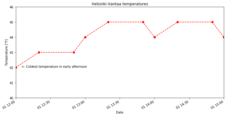
With this datetime issue in mind, let’s now consider a modified version of the plot above, we can
- Limit our time range to 12:00 to 15:00 on October 1, 2019
- Only look at temperatures between 40-46° Fahrenheit
- Add text to note the coldest part of the early afternoon.
[12]:
start_time = pd.to_datetime('201910011200')
end_time = pd.to_datetime('201910011500')
cold_time = pd.to_datetime('201910011205')

ax = oct1_temps.plot(style='ro--', title='Helsinki-Vantaa temperatures',
                     xlim=[start_time, end_time], ylim=[40.0, 46.0])
ax.set_xlabel('Date')
ax.set_ylabel('Temperature [°F]')
ax.text(cold_time, 42.0, '<- Coldest temperature in early afternoon')
[12]:
Text(2019-10-01 12:05:00, 42.0, '<- Coldest temperature in early afternoon')
Task 1
Create a line plot similar to our examples above with the following attributes:
- Temperature data from 18:00-24:00 on October 1
- A dotted black line connecting the observations (do not show the data points)
- A title that reads “Evening temperatures on October 1, Helsinki-Vantaa”
- A text label indicating the warmest temperature in the evening
Bar plots in Pandas
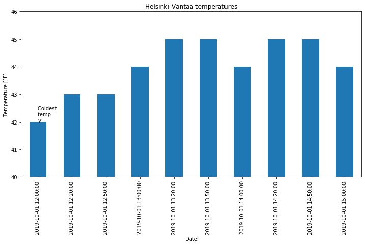
In addition to line plots, there are many other options for plotting in Pandas. Bar plots are one option, which can be used quite similarly to line plots with the addition of the kind=bar parameter. Note that it is easiest to plot our selected time range for a bar plot by selecting the dates in our data series first, rather than adjusting the plot limits. Pandas sees bar plot data as categorical, so the date range is more difficult to define for x-axis limits. For the y-axis, we can still
define its range using the ylim=[ymin, ymax] parameter. Similarly, text placement on a bar plot is more difficult, and most easily done using the index value of the bar where the text should be placed.
[13]:
oct1_afternoon = oct1_temps.loc[oct1_temps.index <= '201910011500']
ax = oct1_afternoon.plot(kind='bar', title='Helsinki-Vantaa temperatures',
                         ylim=[40, 46])
ax.set_xlabel('Date')
ax.set_ylabel('Temperature [°F]')
ax.text(0, 42.0, 'Coldest \ntemp \nv')
[13]:
Text(0, 42.0, 'Coldest \ntemp \nv')

You can find more about how to format bar charts on the Pandas documentation website.
Saving your plots as image files
Saving plots created using Pandas can be done in several ways. The recommendation for use outside of Jupyter notebooks is to use Matplotlib’s plt.savefig() function. When using plt.savefig(), you simply give a list of commands to generate a plot and include plt.savefig() with some parameters as the last command. The file name is required, and the image format will be determined based on the listed file extension.
Matplotlib plots can be saved in a number of useful file formats, including PNG, PDF, and EPS. PNG is a nice format for raster images, and EPS is probably easiest to use for vector graphics. Let’s check out an example and save our lovely bar plot.
[14]:
ax = oct1_afternoon.plot(kind='bar', title='Helsinki-Vantaa temperatures',
                         ylim=[40, 46])
ax.set_xlabel('Date')
ax.set_ylabel('Temperature [°F]')
ax.text(0, 42.0, 'Coldest \ntemp \nv')

plt.savefig('bar-plot.png')

If you refresh your Files tab on the left side of the JupyterLab window you should now see bar-plot.png listed. We could try to save another version in higher resolution with a minor change to our plot commands above.
[15]:
ax = oct1_afternoon.plot(kind='bar', title='Helsinki-Vantaa temperatures',
                         ylim=[40, 46])
ax.set_xlabel('Date')
ax.set_ylabel('Temperature [°F]')
ax.text(0, 42.0, 'Coldest \ntemp \nv')

plt.savefig('bar-plot-hi-res.pdf', dpi=600)
Interactive plotting with Pandas-Bokeh
One of the cool things in Jupyter notebooks is that our plots need not be static. In other words, we can easily create plots that are interactive, allowing us to view data values by mousing over them, or click to enable/disable plotting of some data. There are several ways we can do this, but we’ll utilize the Pandas-Bokeh plotting backend, which allows us to create interactive plots with little additional effort.
To get started, we need to import Pandas-Bokeh and configure our notebook to use it for plotting out Pandas data.
[16]:
import pandas_bokeh

pandas_bokeh.output_notebook()
pd.set_option('plotting.backend', 'pandas_bokeh')
In the cell above, we import Pandas-Bokeh, and the configure two options: (1) Setting the output to be displayed in a notebook rather than in a separate window, and (2) setting the plotting backend software to use Pandas-Bokeh rather than Matplotlib.
Now, we can consider an example plot similar to the one we started with, but with data for three days (September 29-October 1, 2019). Pandas-Bokeh expects a DataFrame as the source for the plot data, so we’ll need to create a time slice of the data DataFrame containing the desired date range before making the plot. Let’s generate the Pandas-Bokeh plot and the see what is different.
[17]:
sept29_oct1_df = data.loc[data.index >= '201909290000']

start_time = pd.to_datetime('201909290000')
end_time = pd.to_datetime('201910020000')

ax = sept29_oct1_df.plot(title='Helsinki-Vantaa temperatures',
                         xlabel='Date', ylabel='Temperature [°F]',
                         xlim=[start_time, end_time], ylim=[35.0, 60.0])
So now we have a similar plot to those generated previously, but when you move the mouse along the curve you can see the temperature values at each time. We can also hide any of the lines by clicking on them in the legend, as well as use the scroll wheel/trackpad to zoom.
But we did also have to make a few small changes to generate this plot:
- We need to use a DataFrame as the data source for the plot, rather than a Pandas Series. Thus,
data['TEMP'].plot()will not work with Pandas-Bokeh. - The x- and y-axis labels are specified using the
xlabelandylabelparameters, rather than usingax.set_xlabel()orax.set_ylabel(). - The line color and plotting of points are not specified using the
stylekeyword. Instead, the line colors could be specified using thecolororcolormapparameters. Plotting of the points is enabled using theplot_data_pointsparameter (see below). More information about formatting the lines can be found on the Pandas-Bokeh website. - We have not included a text label on the plot, as it may not be possible to do so with Pandas-Bokeh.
But otherwise, we are able to produce these cool interactive plots with minimal effort, and directly within our notebooks!
[18]:
ax = sept29_oct1_df.plot(title='Helsinki-Vantaa temperatures',
                         xlabel='Date', ylabel='Temperature [°F]',
                         xlim=[start_time, end_time], ylim=[35.0, 60.0],
                         plot_data_points=True)